


1. Introduction
Fuel efficiency, commonly measured in miles per gallon (MPG), is a critical metric in the automotive industry. With rising fuel costs and growing environmental concerns, improving fuel efficiency has become a top priority for both manufacturers and consumers. A vehicle’s fuel efficiency influences purchasing decisions and plays a role in regulatory compliance and sustainability branding. Understanding the factors contributing to fuel efficiency enables manufacturers to design better-performing vehicles and informs consumers about cost-effective options.
This project focuses on building a predictive regression model to estimate MPG based on vehicle characteristics. The dataset used for this project includes information on various car specifications such as engine size, weight, and horsepower. By analyzing this dataset, we aim to uncover the relationships between these features and fuel efficiency, ultimately providing actionable insights for vehicle optimization.
The process follows a structured approach:
Exploratory Data Analysis (EDA): Understanding the data structure, visualizing distributions, and identifying correlations.
Data Preprocessing: Handling missing values, encoding categorical variables, and creating meaningful features.
Modeling: Building a baseline regression model and evaluating its performance.
Model Improvement: Applying advanced techniques like feature engineering, addressing non-linearity, and hyperparameter tuning.
Whether you’re new to data science or looking to deepen your understanding of regression models, this project offers a hands-on learning experience.
2. Dataset Source
This dataset is widely available in the UCI Machine Learning Repository, a reliable resource for educational datasets, and also included in the Seaborn library. It includes data collected from various sources and is often used as a starting point for machine learning projects in academia and research. Using this dataset offers an excellent opportunity to learn more about regression modeling and the factors influencing fuel efficiency.
Explanation of the dataset structure and features
The MPG dataset is a well-known resource for exploring the factors that influence a vehicle’s fuel efficiency, measured in miles per gallon (MPG). This dataset includes various features related to vehicle specifications, each of which can have a significant impact on MPG. Here’s a breakdown of the key features:
Cylinders: This represents the number of cylinders in the vehicle’s engine. Vehicles with more cylinders typically have larger, more powerful engines, which can consume more fuel.
Displacement: This refers to the total volume of all the cylinders in the engine. Larger displacement generally indicates a more powerful engine that may consume more fuel, impacting MPG negatively.
Horsepower: A measure of engine power. Vehicles with higher horsepower tend to consume more fuel, as they’re often designed for performance rather than efficiency.
Weight: The total weight of the vehicle. Heavier cars require more energy (and thus fuel) to move, leading to lower MPG.
Acceleration: This measures the time it takes for the vehicle to reach a certain speed. Faster acceleration can indicate a performance-oriented vehicle, which may have different fuel efficiency characteristics.
Model Year: This represents the year the vehicle model was produced. It can also reflect the advancements in technology over time, as newer cars generally benefit from improvements in fuel efficiency.
Origin: A categorical variable representing the vehicle’s manufacturing region (e.g., USA, Europe, or Asia). Different regions may follow different engineering practices, which can influence fuel efficiency.
Name: This column contains the names of the vehicles, which usually include the make and model. Since the names are unique identifiers and don’t have a direct numerical impact on fuel efficiency, this column is often considered non-informative for predictive modelling. However, it can be useful for reference or exploration, especially if we want to identify specific cars in the dataset. In most cases, we won’t use this column directly in the regression model, as it doesn’t contribute to predicting MPG.
Below are my code snippets and their outputs:
# Import libraries
import numpy as np
import pandas as pd
import seaborn as sns
import matplotlib.pyplot as plt

# Load the dataset
mpg_df = sns.load_dataset('mpg')
mpg_df.head()
print(mpg_df.head())
mpg  cylinders  horsepower  weight   age  origin_japan  origin_usa
0  18.0          8       130.0    3504  1955             0           1
1  15.0          8       165.0    3693  1955             0           1
2  18.0          8       150.0    3436  1955             0           1
3  16.0          8       150.0    3433  1955             0           1
4  17.0          8       140.0    3449  1955             0           1
# Drop the 'name' column since it is it typically contains unique, non-numeric values without any order that don't provide any meaningful information for the model to learn from
mpg_df.drop('name', axis=1, inplace=True)
mpg_df.head()
# Summary of the dataset
mpg_df.info()
print(mpg_df.isnull().sum())
<class 'pandas.core.frame.DataFrame'>
RangeIndex: 398 entries, 0 to 397
Data columns (total 9 columns):
 #   Column        Non-Null Count  Dtype
---  ------        --------------  -----
 0   mpg           398 non-null    float64
 1   cylinders     398 non-null    int64
 2   displacement  398 non-null    float64
 3   horsepower    392 non-null    float64
 4   weight        398 non-null    int64
 5   acceleration  398 non-null    float64
 6   model_year    398 non-null    int64
 7   origin        398 non-null    object
 8   name          398 non-null    object
dtypes: float64(4), int64(3), object(2)
memory usage: 28.1+ KB
mpg             0
cylinders       0
displacement    0
horsepower      6
weight          0
acceleration    0
model_year      0
origin          0
name            0
dtype: int64
Our dataset consists of 398 entries with 8 columns. Each column represents a different feature related to vehicle specifications. Here’s a quick overview of the data types:
mpg (float), displacement (float), horsepower (float), and acceleration (float) are continuous numerical features.
cylinders and model_year are integers, representing discrete values.
weight is also an integer, representing discrete numerical data.
origin is an object type, indicating a categorical variable.
In this dataset, we noticed that the horsepower column contains 6 missing values. Addressing these missing values is essential, as they could impact our model if left untreated. We will discuss handling these missing values later in our data preprocessing step.
The Target Variable: MPG
The target variable in this dataset is MPG (miles per gallon), which indicates how many miles a vehicle can travel on one gallon of fuel. MPG is an important measure for both consumers and manufacturers, as it provides insight into a vehicle’s fuel economy. Our goal in this project is to use the other features to predict MPG, giving us a deeper understanding of how different vehicle attributes contribute to fuel efficiency.
By examining and modeling the relationships between these features and MPG, we can gain insights into the complex factors that determine a vehicle’s fuel consumption. This forms the foundation for the predictive model we’ll be building in this project.
3. Data Exploration and Visualization
Visualizing Feature Distributions
EDA is an essential step for understanding the MPG dataset’s structure and identifying issues that could affect our predictions. Here’s why it’s important:
- Understanding Data Distributions: By visualizing the distributions of features like
cylinders,horsepower, andweight, we can see how vehicle characteristics vary. For instance, we notice that some features, likedisplacementandweight, are right-skewed, indicating most cars are on the lighter side but a few are much heavier. These insights help us decide if transformations are needed to make our data more suitable for modeling.
# Drop rows with missing values
mpg_df.dropna(inplace=True)

# Distribution of all variables
plt.figure(figsize=(16, 10))
for i, column in enumerate(mpg_df.columns, 1):
    plt.subplot(3, 3, i)
    sns.histplot(mpg_df[column], kde=True, bins=20)
    plt.title(f'Distribution of {column}')
    plt.tight_layout()

# Show the plot
plt.show()
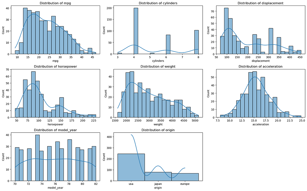
Histograms of all variables
- Identifying Skewness, Outliers, and Missing Data: The dataset has some missing values in
horsepowerand outliers in features likeweight. Skewed distributions and outliers can distort linear regression predictions, so addressing them early is crucial. EDA also reveals missing values, guiding our decisions on whether to impute or remove affected entries.
Overall, EDA helps us clean and prepare the MPG dataset, ensuring our model captures accurate relationships between vehicle features and fuel efficiency.
Feature Correlations
Correlations help us understand relationships between features, which can:
Guide Feature Selection: If two features are highly correlated, they might contribute redundant information. Removing one of these features can simplify the model without sacrificing accuracy.
Identify Multicollinearity: In linear regression models, multicollinearity (high correlation between independent variables) can lead to unstable estimates of coefficients, making it hard to interpret the model’s output.
We’ll use a correlation matrix to visualize feature correlations and plot it as a heatmap.
# Select only the numeric columns for the correlation matrix
numeric_df = mpg_df.select_dtypes(include=['number'])

# Calculate the correlation matrix
correlation_matrix = numeric_df.corr()

# Set up the matplotlib figure
plt.figure(figsize=(10, 8))

# Create a heatmap to visualize the correlations
sns.heatmap(correlation_matrix, annot=True, cmap='coolwarm', center=0, linewidths=0.5)
plt.title("Feature Correlation Heatmap")
plt.show()
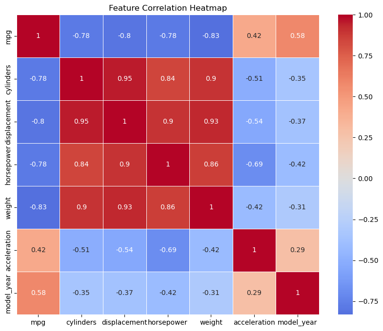
Correlation heatmap of numeric variables
In this heatmap:
Displacement and Horsepower: These features show a high positive correlation since a larger engine displacement generally indicates a more powerful engine, which is reflected by higher horsepower.
Acceleration and weight: Similarly, heavier cars often have slower acceleration rates, creating a correlation between these two features.
The heatmap helps us spot these relationships quickly, informing decisions on which features to keep or transform. By understanding these correlations, we can reduce redundancy and ensure that our model captures distinct information from each feature.
3. Data Preprocessing
Handling Multicollinearity
To simplify our model and reduce multicollinearity, we’ll drop two features, acceleration and displacement. These features are highly correlated with other features like horsepower and weight, which provide similar information. By removing these redundant features, we improve the model's interpretability and reduce unnecessary complexity.
# Drop 'acceleration' and 'displacement' columns
mpg_df.drop(["acceleration", "displacement"], axis=1, inplace=True)
Creating an ‘Age’ Feature
To provide more meaningful information about a vehicle’s age, we’ll create an age feature. This feature is calculated by subtracting the vehicles model_year from the current year. The age feature can help capture the effect of technological advancements on fuel efficiency, with newer cars typically having better MPG due to improved designs.
from datetime import datetime

# Get the current year
today = datetime.today()
this_year = today.year

# Calculate 'age' and drop the original 'model_year' column
mpg_df["age"] = this_year - mpg_df["model_year"]
mpg_df.drop(["model_year"], axis=1, inplace=True)
Encoding the ‘Origin’ Column
The origin column represents the geographic region where the vehicle was manufactured and is a categorical variable. Since machine learning models generally work with numeric data, we’ll use one-hot encoding to convert this column into dummy variables. One-hot encoding creates new binary columns for each unique value in the origin column (e.g., USA, Europe, Asia), where each column indicates whether a car belongs to that region.
One-hot encoding is the preferred approach here because:
It maintains information about each category without introducing ordinal relationships (since
origincategories are nominal).It allows the model to interpret each category distinctly, which is helpful for regression models.
# Perform one-hot encoding on the 'origin' column
mpg_df = pd.get_dummies(mpg_df, columns=['origin'], drop_first=True)
Using drop_first=True helps avoid the dummy variable trap by reducing multicollinearity among the encoded columns. With these preprocessing steps, our dataset is now ready for feature scaling and transformation. We’ve addressed multicollinearity, created a more informative feature, and ensured all data is in a numeric format for modeling.
Here is the partial data frame after preprocessing:

Output of: mpg_df.head()
4. Building and Evaluating the Regression Model
Choosing a Model
For this project, we’ll start with a linear regression model, which is an excellent choice for beginners. Linear regression is intuitive and relatively simple, making it a foundational tool for understanding relationships between variables. The idea behind linear regression is to find a linear relationship between the independent variables (features) and the dependent variable (target). In our case, we aim to predict miles per gallon (MPG) based on features like weight, horsepower, and age.
In a linear regression model, the relationship is represented by a line or a plane in multi-dimensional space, with each feature contributing to the final prediction based on its coefficient. These coefficients indicate the strength and direction of each feature’s influence on the target variable. Since linear regression assumes a linear relationship, it’s suitable for exploring data where we expect a direct proportional change in the target variable relative to changes in the features.
Splitting the Dataset
To evaluate our model’s performance, we need to split the dataset into two parts: a training set and a testing set. The training set is used to train the model, while the testing set allows us to assess its performance on unseen data. A common approach is to use an 80/20 split, where 80% of the data is used for training and 20% for testing. This ensures that our model has enough data to learn patterns while still being tested on a separate set to gauge its predictive accuracy.
from sklearn.model_selection import train_test_split

# Define the features and target variable
X = mpg_df.drop("mpg", axis=1)
y = mpg_df["mpg"]

# Split the dataset into training and testing sets
X_train, X_test, y_train, y_test = train_test_split(X, y, test_size=0.2, random_state=42)
In this code, random_state=42 ensures reproducibility, so you’ll get the same split each time you run the code.
Model Training
Now that our data is prepared, we can train a simple linear regression model using the training set. Training involves finding the best-fit line that minimizes the error between the predicted and actual MPG values.
from sklearn.linear_model import LinearRegression

# Initialize the linear regression model
model = LinearRegression()

# Train the model on the training data
model.fit(X_train, y_train)
The fit() function calculates the coefficients for each feature, learning how they contribute to predicting MPG. With the model trained, it’s now ready to make predictions on new data.
Model Evaluation
To evaluate the model’s performance, we’ll use the testing set and three common metrics for regression:
from sklearn.metrics import mean_absolute_error, mean_squared_error, r2_score
import numpy as np

# Make predictions on the test set
y_pred = model.predict(X_test)

# Calculate evaluation metrics
mae = mean_absolute_error(y_test, y_pred)
rmse = np.sqrt(mean_squared_error(y_test, y_pred))
r2 = r2_score(y_test, y_pred)

# Display the results
print(f"Mean Absolute Error (MAE): {mae}")
print(f"Root Mean Squared Error (RMSE): {rmse}")
print(f"R-squared (R²): {r2}")
Mean Absolute Error (MAE): 2.518828157615086
Root Mean Squared Error (RMSE): 3.3522919059686704
R-squared (R²): 0.7798249880881907
Mean Absolute Error (MAE): 2.52
The MAE represents the average absolute difference between the predicted and actual MPG values. In this case, an MAE of 2.52 means that, on average, the model’s predictions are off by about 2.52 MPG.
This is a relatively intuitive measure that provides a direct sense of the average prediction error. For a beginner model, this level of error may be acceptable, but there could be room for improvement.
Root Mean Squared Error (RMSE): 3.35
The RMSE penalizes larger errors more heavily, as it squares the individual errors before averaging them and then takes the square root. Here, an RMSE of 3.35 indicates that the model has a typical error of 3.35 MPG when making predictions.
Since RMSE is more sensitive to large deviations than MAE, this suggests that while the model performs reasonably well on average, there may be some larger prediction errors. Reducing the RMSE could mean finding ways to better handle any outliers or highly variable data points.
R-squared (R²): 0.78
The R-squared value of 0.78 suggests that approximately 78% of the variance in MPG can be explained by the features in the model. This is a reasonably good fit, especially for an initial linear regression model.
An R-squared value close to 1 would indicate a strong relationship between the features and the target variable. With an R² of 0.78, the model captures a significant portion of the underlying pattern, but there’s still room for improvement, as 22% of the variance is unexplained by the current features.
Prediction Error Plot
The Prediction Error Plot provides a visual representation of how well the model’s predictions align with the actual values. Here’s what the code does:
from yellowbrick.regressor import PredictionError

# Instantiate the visualizer
visualizer = PredictionError(lm_model)

visualizer.fit(X_train, y_train)  # Fit the training data to the visualizer
visualizer.score(X_test, y_test)  # Evaluate the model on the test data
visualizer.show() # Finalize and render the figure
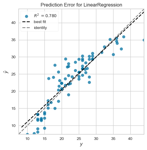
Prediction error plot
Diagonal Line (Identity Line): This dashed line represents perfect predictions, where the predicted values (
ŷ) are exactly equal to the actual values (y). Points along this line indicate accurate predictions.Best Fit Line: The solid line represents the line of best fit for the model’s predictions against the actual values. The closer this line is to the identity line, the more accurate the model.
Data Points Spread: In your plot, many points are reasonably close to the identity line, which indicates that the model is performing fairly well. However, there is some noticeable spread, especially for lower and higher MPG values, indicating that the model has some prediction errors.
Test R-squared Value: The Test R² value of 0.780 suggests that the model explains about 78% of the variance in MPG. This is a good result, showing that the model captures a significant portion of the relationship between features and MPG but still has room for improvement.
Interpretation*: Overall, the model performs well, with most predictions close to the actual values. The slight deviations, especially at the extremes, suggest that the model could be further improved by addressing non-linearities or exploring additional features.*
Residuals Plot
The residual plot shows the distribution of the residuals (errors) across the predicted values. This helps to evaluate whether the model meets the assumptions of linear regression, particularly that residuals should be randomly distributed around zero. Here’s the code:
from yellowbrick.regressor import ResidualsPlot

# Instantiate the visualizer
visualizer = ResidualsPlot(lm_model)

visualizer.fit(X_train, y_train) # Fit the training data to the visualizer
visualizer.score(X_test, y_test) # Evaluate the model on the test data

visualizer.show() # Finalize and render the figure
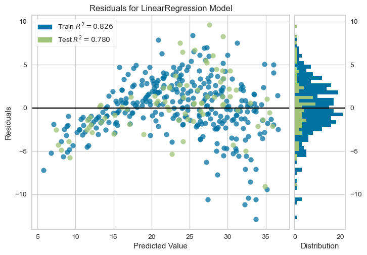
Residuals Plot
Residuals Distribution: The residuals plot shows the difference between the predicted and actual values (errors). Ideally, residuals should be randomly scattered around the horizontal line at zero, indicating that the model’s errors are unbiased.
Train and Test R-squared: Here, the training set has an R² of 0.826, while the test set has an R² of 0.780. The consistency between these values suggests the model generalizes well to new data without significant overfitting.
The pattern in Residuals: While the residuals are mostly centered around zero, there is a slight funnel shape (more spread at higher predicted values). This indicates potential heteroscedasticity, where the variance of errors increases with the predicted value. This suggests that the linear model might not be capturing all the complexity in the data, particularly for vehicles with higher MPG values.
Residual Histogram: The histogram on the right shows the distribution of residuals. A roughly symmetric distribution around zero is a good sign, though any skewness or clustering could indicate areas where the model’s predictions are systematically off.
Interpretation: The residuals plot suggests that the model’s errors are generally unbiased, with residuals evenly spread around zero for most of the data range. The slight pattern at higher values suggests that the model may not fully capture the relationships for cars with high MPG. To improve, you might consider transformations on skewed features or exploring a more flexible (non-linear) model.
5. Improving the model
While our initial linear regression model provides a solid foundation for predicting MPG, there are several ways we can improve its accuracy and reliability. Here are a few strategies to enhance our model:
Feature Engineering
Adding Interaction Terms and Polynomial Features:
Interaction terms can reveal complex relationships between features. For example, the combined effect of
weightandhorsepoweronmpgcan be captured by multiplying these features.Polynomial features allow the model to fit non-linear relationships effectively.
# Generate polynomial features
from sklearn.preprocessing import PolynomialFeatures

poly = PolynomialFeatures(degree=2, include_bias=False)
X_poly = poly.fit_transform(X_train)

# Fit model with polynomial features
poly_model = LinearRegression()
poly_model.fit(X_poly, y_train)

# Evaluate the model
X_test_poly = poly.transform(X_test)
y_pred_poly = poly_model.predict(X_test_poly)

mae_poly = mean_absolute_error(y_test, y_pred_poly)
rmse_poly = np.sqrt(mean_squared_error(y_test, y_pred_poly))
r2_poly = r2_score(y_test, y_pred_poly)

print(f"Polynomial Features - MAE: {mae_poly}, RMSE: {rmse_poly}, R²: {r2_poly}")
Polynomial Features - MAE: 1.9432200658548462, RMSE: 2.6385309564841632, R²: 0.8636017622367672
The polynomial features model achieves the following metrics:
MAE: 1.94 (vs. baseline MAE of ~2.52) — a 23% improvement, indicating more accurate predictions on average.
RMSE: 2.64 (vs. baseline RMSE of ~3.35) — a 21% reduction, showing better handling of larger errors.
R²: 0.864 (vs. baseline R² of 0.78) — a significant increase, explaining 86.4% of the variance, up from 78%.
In conclusion, adding polynomial features has noticeably improved the model's performance, capturing non-linear relationships more effectively and reducing both average and large prediction errors. However, this may increase the complexity and risk of overfitting, which should be monitored with cross-validation.
Addressing Non-Linearity
Transforming Features: Transformations like log and sqrt can linearize relationships and reduce the effect of outliers.
# Apply log transformation
mpg_df['log_weight'] = np.log(mpg_df['weight'])
mpg_df['sqrt_horsepower'] = np.sqrt(mpg_df['horsepower'])
Testing Non-Linear Models: Random Forest and Gradient Boosting can naturally handle non-linear relationships.
from sklearn.ensemble import RandomForestRegressor

rf_model = RandomForestRegressor(random_state=42)
rf_model.fit(X_train, y_train)
y_pred_rf = rf_model.predict(X_test)

# Metrics
mae_rf = mean_absolute_error(y_test, y_pred_rf)
rmse_rf = np.sqrt(mean_squared_error(y_test, y_pred_rf))
r2_rf = r2_score(y_test, y_pred_rf)

print(f"Random Forest - MAE: {mae_rf}, RMSE: {rmse_rf}, R²: {r2_rf}")
Random Forest - MAE: 1.8608303797468349, RMSE: 2.5723633861669417, R²: 0.8703570184651812
The Random Forest model demonstrates excellent performance with an MAE of 1.86, RMSE of 2.57, and R² of 0.87, outperforming both the baseline and polynomial models. Its ability to handle non-linear relationships and interactions between features contributes to this improvement, achieving the lowest error metrics and explaining 87% of the variance in the target variable. This makes Random Forest the best-performing model in this analysis, highlighting its robustness and suitability for this dataset.
Regularization
Applying Ridge Regression: Ridge adds penalties to large coefficients, reducing overfitting.
from sklearn.linear_model import Ridge

ridge_model = Ridge(alpha=1.0)
ridge_model.fit(X_train, y_train)
y_pred_ridge = ridge_model.predict(X_test)

# Metrics
mae_ridge = mean_absolute_error(y_test, y_pred_ridge)
rmse_ridge = np.sqrt(mean_squared_error(y_test, y_pred_ridge))
r2_ridge = r2_score(y_test, y_pred_ridge)

print(f"Ridge Regression - MAE: {mae_ridge}, RMSE: {rmse_ridge}, R²: {r2_ridge}")
Ridge Regression - MAE: 2.513967396293555, RMSE: 3.347807781836627, R²: 0.7804136192673445
The Ridge Regression model achieves an MAE of 2.51, RMSE of 3.35, and R² of 0.78, showing performance nearly identical to the baseline linear regression model. While it does not significantly improve predictive accuracy, it helps stabilize the model by penalizing large coefficients, which reduces the risk of overfitting. This makes Ridge Regression a valuable option for datasets with multicollinearity or when model generalization is a priority, even if its predictive performance remains unchanged.
Cross-validation and Hyperparameter Tuning
To ensure generalization, apply k-fold cross-validation and tune hyperparameters.
from sklearn.model_selection import cross_val_score, GridSearchCV

# Cross-validation
cv_scores = cross_val_score(ridge_model, X_train, y_train, cv=5, scoring='r2')
print("Cross-Validation R² Scores:", cv_scores)

# Hyperparameter tuning
param_grid = {'alpha': [0.1, 1.0, 10]}
grid_search = GridSearchCV(Ridge(), param_grid, cv=5, scoring='r2')
grid_search.fit(X_train, y_train)
print("Best Parameters:", grid_search.best_params_)
Cross-Validation R² Scores: [0.82049764 0.81203289 0.77575085 0.80499273 0.84868288]
Best Parameters: {'alpha': 10}
The cross-validation R² scores range from 0.775 to 0.849, with an average performance of approximately 0.812, indicating consistent model performance across different data splits. The best hyperparameter identified is alpha = 10, suggesting a stronger regularization penalty improves the model's ability to generalize. This balance between bias and variance highlights the importance of hyperparameter tuning in optimizing Ridge Regression.
Summary of Model Performance

Analysis:
Polynomial Features: Delivered a significant improvement over the baseline, reducing both MAE and RMSE while increasing the R² to 0.864, making it an effective choice for capturing non-linear relationships.
Ridge Regression: Maintained stability with similar metrics to the baseline, demonstrating its strength in regularization but limited impact on overall performance for this dataset.
Random Forest: Outperformed all other models, achieving the lowest error metrics (MAE: 1.86, RMSE: 2.57) and the highest R² (0.87). Its ability to model complex, non-linear relationships makes it the best choice for this dataset.
in conclusion, Random Forest is the best-performing model, followed by Polynomial Regression, which balances complexity and performance. Ridge Regression offers regularization benefits but does not significantly improve accuracy in this case. Future work could focus on fine-tuning Random Forest hyperparameters for further gains.
6. Conclusion and Key Takeaways
This project demonstrated the journey from data exploration to predictive modeling to estimate fuel efficiency (MPG). Through iterative improvements, we applied various techniques, including polynomial features, regularization, and non-linear models like Random Forest, to refine model accuracy. The process highlighted the significance of rigorous data preprocessing, detailed EDA, and thoughtful feature engineering as foundations for building robust predictive models.
Key findings revealed that Random Forest outperformed other approaches due to its ability to capture complex, non-linear relationships, making it ideal for this dataset. Polynomial regression also delivered significant improvements over the baseline by enhancing the model's flexibility. Regularization techniques like Ridge Regression added stability, although they showed limited gains in this context.
Overall, predictive modeling plays a crucial role in optimizing automotive performance and sustainability. By leveraging data-driven insights, we can support the development of more efficient vehicles while addressing economic and environmental concerns.