eCommerce Customer Segmentation Using Machine Learning
Unveiling Customer Behavior with K-Means Clustering for Targeted Business Strategies

1. Introduction
Customer segmentation is essential for businesses to understand their diverse customer base and offer personalized experiences. By dividing customers into distinct groups based on purchasing behavior, demographics, and preferences, companies can craft targeted marketing campaigns, improve customer satisfaction, and optimize product offerings to meet specific needs.
In this project, we utilize unsupervised machine learning techniques, specifically K-Means Clustering and Hierarchical Clustering, to segment customers based on their shopping patterns. The analysis is performed using the cust_data.csv dataset, which contains features such as gender, order history, total spending, and brand interactions. These clustering techniques allow us to identify meaningful patterns and create distinct customer segments. This segmentation provides actionable insights to help businesses design data-driven strategies, improve customer retention, and increase revenue.
Key Techniques Used in This Project:
K-Means Clustering: A widely used clustering algorithm that groups customers into K-distinct clusters based on feature similarity.
Elbow Method: A technique to determine the optimal number of clusters for K-Means.
Silhouette Score: A metric to assess the quality of clusters formed.
Hierarchical Clustering: A method that creates a hierarchy of clusters using a bottom-up approach.
Data Preprocessing: Handling missing values, normalizing numerical data, and encoding categorical variables to prepare data for clustering.
2. Understanding the Dataset
The dataset used in this project, cust_data.csv, contains information about customer demographics and behaviors. Below are the key features in the dataset and their significance:
Cust_ID: A unique identifier for each customer.Gender: Indicates the gender of the customer (Mfor male,Ffor female). Understanding the gender distribution helps businesses design targeted campaigns.Orders: Represents the number of orders placed by a customer. This feature provides insights into purchasing frequency.Total Spending: The total amount spent by a customer, which is crucial for identifying high-value customers.Brand Interaction Columns: Features representing customer interactions with various brands (e.g.,
Samsung,Nike). These help identify brand preferences and loyalty patterns.
By understanding the relationships between these features, we can develop meaningful customer segments that reflect diverse shopping behaviors and preferences.
3. Exploratory Data Analysis (EDA)
Import all necessary libraries
# Importing all necessary libraries
import numpy as np
import pandas as pd
import matplotlib.pyplot as plt
from sklearn.preprocessing import MinMaxScaler
import seaborn as sns
from sklearn.metrics import silhouette_score
from sklearn.cluster import KMeans
from yellowbrick.cluster import KElbowVisualizer
Dataset Overview
First, let’s examine the dataset structure, check for missing values, and inspect the first few rows.
# Load the dataset
df = pd.read_csv('cust_data.csv')

# Display dataset information
print(df.info())
<class 'pandas.core.frame.DataFrame'>
RangeIndex: 30000 entries, 0 to 29999
Data columns (total 38 columns):
 #   Column                  Non-Null Count  Dtype
---  ------                  --------------  -----
 0   Cust_ID                 30000 non-null  int64
 1   Gender                  27276 non-null  object
 2   Orders                  30000 non-null  int64
 3   Jordan                  30000 non-null  int64
 4   Gatorade                30000 non-null  int64
 5   Samsung                 30000 non-null  int64
 6   Asus                    30000 non-null  int64
 7   Udis                    30000 non-null  int64
 8   Mondelez International  30000 non-null  int64
 9   Wrangler                30000 non-null  int64
 10  Vans                    30000 non-null  int64
 11  Fila                    30000 non-null  int64
 12  Brooks                  30000 non-null  int64
 13  H&M                     30000 non-null  int64
 14  Dairy Queen             30000 non-null  int64
 15  Fendi                   30000 non-null  int64
 16  Hewlett Packard         30000 non-null  int64
 17  Pladis                  30000 non-null  int64
 18  Asics                   30000 non-null  int64
 19  Siemens                 30000 non-null  int64
 20  J.M. Smucker            30000 non-null  int64
 21  Pop Chips               30000 non-null  int64
 22  Juniper                 30000 non-null  int64
 23  Huawei                  30000 non-null  int64
 24  Compaq                  30000 non-null  int64
 25  IBM                     30000 non-null  int64
 26  Burberry                30000 non-null  int64
 27  Mi                      30000 non-null  int64
 28  LG                      30000 non-null  int64
 29  Dior                    30000 non-null  int64
 30  Scabal                  30000 non-null  int64
 31  Tommy Hilfiger          30000 non-null  int64
 32  Hollister               30000 non-null  int64
 33  Forever 21              30000 non-null  int64
 34  Colavita                30000 non-null  int64
 35  Microsoft               30000 non-null  int64
 36  Jiffy mix               30000 non-null  int64
 37  Kraft                   30000 non-null  int64
dtypes: int64(37), object(1)
memory usage: 8.7+ MB
None
# Display the first few rows
print(df.head())
   Cust_ID Gender  Orders  Jordan  Gatorade  Samsung  Asus  Udis  \
0        1      M       7       0         0        0     0     0
1        2      F       0       0         1        0     0     0
2        3      M       7       0         1        0     0     0
3        4      F       0       0         0        0     0     0
4        5    NaN      10       0         0        0     0     0

   Mondelez International  Wrangler  ...  LG  Dior  Scabal  Tommy Hilfiger  \
0                       0         0  ...   0     0       0               0
1                       0         0  ...   0     1       0               0
2                       0         0  ...   0     0       0               0
3                       0         0  ...   0     0       0               0
4                       0         0  ...   0     0       2               0

   Hollister  Forever 21  Colavita  Microsoft  Jiffy mix  Kraft
0          0           0         0          0          0      0
1          0           0         0          0          0      0
2          0           0         0          1          0      0
3          0           0         0          0          0      0
4          0           0         0          0          1      1

[5 rows x 38 columns]
# Display basic statistics
print(df.describe())
Cust_ID        Orders        Jordan      Gatorade       Samsung  \
count  30000.000000  30000.000000  30000.000000  30000.000000  30000.000000
mean   15000.500000      4.169800      0.267433      0.252333      0.222933
std     8660.398374      3.590311      0.804778      0.705368      0.917494
min        1.000000      0.000000      0.000000      0.000000      0.000000
25%     7500.750000      1.000000      0.000000      0.000000      0.000000
50%    15000.500000      4.000000      0.000000      0.000000      0.000000
75%    22500.250000      7.000000      0.000000      0.000000      0.000000
max    30000.000000     12.000000     24.000000     15.000000     27.000000

               Asus          Udis  Mondelez International      Wrangler  \
count  30000.000000  30000.000000            30000.000000  30000.000000
mean       0.161333      0.143533                0.139767      0.106933
std        0.740038      0.641258                0.525840      0.515921
min        0.000000      0.000000                0.000000      0.000000
25%        0.000000      0.000000                0.000000      0.000000
50%        0.000000      0.000000                0.000000      0.000000
75%        0.000000      0.000000                0.000000      0.000000
max       17.000000     14.000000               31.000000      9.000000

               Vans  ...            LG          Dior        Scabal  \
count  30000.000000  ...  30000.000000  30000.000000  30000.000000
mean       0.111433  ...      0.102533      0.271133      0.370067
std        0.547990  ...      0.486376      0.714682      0.758465
min        0.000000  ...      0.000000      0.000000      0.000000
25%        0.000000  ...      0.000000      0.000000      0.000000
50%        0.000000  ...      0.000000      0.000000      0.000000
75%        0.000000  ...      0.000000      0.000000      1.000000
max       16.000000  ...     19.000000     12.000000     11.000000

       Tommy Hilfiger     Hollister    Forever 21      Colavita     Microsoft  \
count    30000.000000  30000.000000  30000.000000  30000.000000  30000.000000
mean         0.158967      0.077667      0.057333      0.192200      0.116367
std          0.510527      0.383370      0.300082      0.641306      0.446578
min          0.000000      0.000000      0.000000      0.000000      0.000000
25%          0.000000      0.000000      0.000000      0.000000      0.000000
50%          0.000000      0.000000      0.000000      0.000000      0.000000
75%          0.000000      0.000000      0.000000      0.000000      0.000000
max          8.000000      9.000000      8.000000     22.000000     14.000000

          Jiffy mix         Kraft
count  30000.000000  30000.000000
mean       0.088033      0.070900
std        0.399277      0.387915
min        0.000000      0.000000
25%        0.000000      0.000000
50%        0.000000      0.000000
75%        0.000000      0.000000
max        8.000000     16.000000

[8 rows x 37 columns]
Output:
The dataset contains 30,000 rows and 38 columns, with 37 integer columns and 1 object column (
Gender).The
Gendercolumn has 27,276 non-null values, indicating 2,724 missing values.Features like
Ordersand brand-specific columns (e.g.,Samsung,Nike) represent customer interactions with various brands.
Key descriptive statistics:
The mean and standard deviation for features like
OrdersandJordanindicate typical customer behavior.Features like
SamsungandGatoradehave outliers, as their maximum values are significantly higher than their 75th percentile.
Handling Missing Values
The missing values in the Gender column will be imputed using the mode to preserve the overall gender distribution in the dataset while avoiding data loss.
# Fill missing values in 'Gender' with the mode
gender_mode = df['Gender'].mode()[0]
df['Gender'].fillna(gender_mode, inplace=True)

# Verify missing values
print(df['Gender'].isnull().sum())
0
Missing values in the Gender column is successfully filled, with no missing values remaining.
Checking for Duplicates
# Check for duplicates
print(f"Duplicate rows: {df.duplicated().sum()}")
Duplicate rows: 0
No duplicate rows were detected, so no additional cleaning is required for this step.
Visualizing Customer Attributes
Demographic Analysis: Gender Distribution
# Plot gender distribution
sns.countplot(data=df, x='Gender')
plt.title('Gender Distribution')
plt.show()
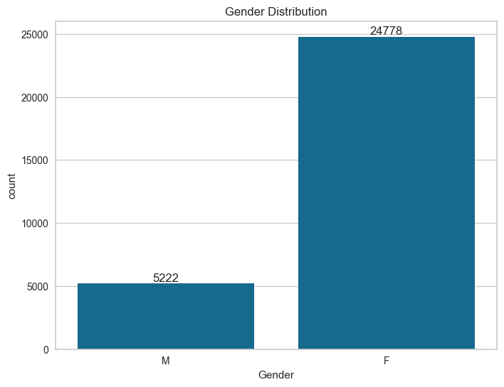
Female customers significantly outnumber male customers in the dataset.
Order Analysis: Overall Orders and Gender Breakdown
# Plot overall order count and gender breakdown
plt.figure(figsize=(15, 5))
plt.subplot(1, 2, 1)
sns.countplot(data=df, x='Orders')
plt.title('Overall Orders')

plt.subplot(1, 2, 2)
sns.countplot(data=df, x='Orders', hue='Gender')
plt.title('Orders by Gender')
plt.show()
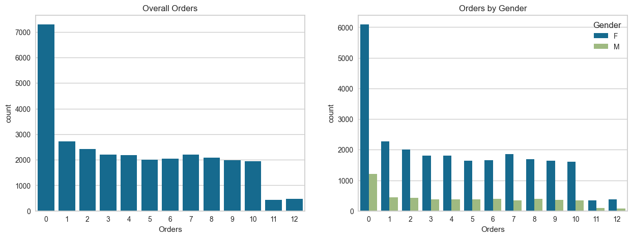
The plots show the distribution of customer orders:
Overall Orders: The majority of customers placed 0 orders, followed by a relatively even distribution of 1–9 orders, with very few customers placing 10–12 orders.
Orders by Gender: Female customers consistently placed more orders across all order ranges compared to male customers, with the gap most significant among customers with no orders.
Brand Preferences
To analyze customer interactions with specific brands, we plot the frequency of interactions for the most popular brands.
# Select top brands based on total interactions
top_brands = new_df.iloc[:, 3:-1].sum().sort_values(ascending=False).head(10)

# Plot bar chart for top brand interactions
plt.figure(figsize=(12, 6))
ax = sns.barplot(x=top_brands.index, y=top_brands.values)
plt.title('Top 10 Brands by Interaction Frequency')
plt.ylabel('Total Interactions')
plt.xlabel('Brand')
plt.xticks(rotation=45)

# Add the value of each bar on top
for p in ax.patches:
    ax.annotate(format(p.get_height(), '.0f'),
                (p.get_x() + p.get_width() / 2, p.get_height()),
                ha='center', va='center',
                xytext=(0, 10),
                textcoords='offset points')

plt.show()

The plot highlights the top 10 brands by interaction frequency:
J.M. Smucker leads significantly with 22,644 interactions, far surpassing other brands.
Juniper and Burberry follow with 14,125 and 12,841 interactions, respectively.
Brands like Gatorade and Huawei rank lower in the top 10 but still maintain substantial interaction levels (~7,500 interactions).
The distribution shows a sharp decline in interactions after the top 3 brands, emphasizing the dominance of a few popular brands.
Creating the Total Search Column
A new column, Total Search, is created by summing all brand-specific interaction columns.
# Create a new dataframe
new_df = df.copy()

# Create the 'Total Search' column
new_df['Total Search'] = new_df.iloc[:, 3:].sum(axis=1)

# Display the first few rows
print(new_df.head())
   Cust_ID Gender  Orders  Jordan  Gatorade  Samsung  Asus  Udis  \
0        1      M       7       0         0        0     0     0
1        2      F       0       0         1        0     0     0
2        3      M       7       0         1        0     0     0
3        4      F       0       0         0        0     0     0
4        5      F      10       0         0        0     0     0

   Mondelez International  Wrangler  ...  Dior  Scabal  Tommy Hilfiger  \
0                       0         0  ...     0       0               0
1                       0         0  ...     1       0               0
2                       0         0  ...     0       0               0
3                       0         0  ...     0       0               0
4                       0         0  ...     0       2               0

   Hollister  Forever 21  Colavita  Microsoft  Jiffy mix  Kraft  Total Search
0          0           0         0          0          0      0             2
1          0           0         0          0          0      0            18
2          0           0         0          1          0      0             5
3          0           0         0          0          0      0             2
4          0           0         0          0          1      1            16

[5 rows x 39 columns]
Top 10 Customers by Total Searches
To identify the top customers based on their total searches:
# Top 10 customers based on Total Search
plt_data = new_df.sort_values('Total Search', ascending=False)[['Cust_ID', 'Gender', 'Total Search']].head(10)

# Plot
sns.barplot(data=plt_data,
            x='Cust_ID',
            y='Total Search',
            hue='Gender',
            order=plt_data.sort_values('Total Search', ascending=False).Cust_ID)
plt.title("Top 10 Customers Based on Total Searches")
plt.show()
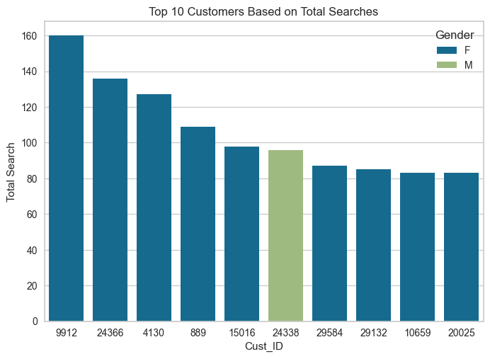
The plot shows the top 10 customers based on their total searches. Key observations:
Customer 9912 has the highest total searches (160), followed by customer 24366 (136).
Female customers dominate the top 10 searchers, with only one male customer (24338) included.
There is a notable gap between the top two customers and the rest in terms of search activity.
Detecting Outliers
To analyze outliers in various features, such as Orders and interactions with brands, we use histograms and boxplots.
Histograms for Orders and Brand Interactions
Histograms provide a view of the distribution of Orders and each brand's interactions.
# Plot histograms for all features from 'Orders' onwards
new_df.iloc[:, 2:].hist(figsize=(40, 30))
plt.show()
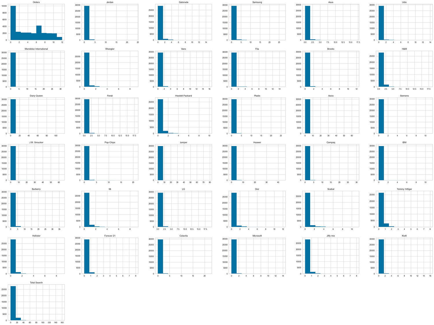
The histograms show the distribution of interactions across different features:
Orders: Most customers place fewer than 5 orders, with the distribution skewed towards lower values.
Brand Interactions: Most customers have minimal or no interactions with brands, as nearly all brand-specific columns show a peak at 0.
Total Search: Follows a similar pattern, with a small number of customers performing significantly more searches compared to the majority.
This indicates highly skewed distributions and highlights a small group of highly active customers.
Boxplots for Brand-Specific Interactions
To detect outliers, boxplots for each feature are generated to highlight customers with unusually high values.
# Generate boxplots for orders and brand-specific columns
cols = list(new_df.columns[2:])
def dist_list(lst):
    plt.figure(figsize=(40, 30))
    for i, col in enumerate(lst, 1):
        plt.subplot(6, 6, i)
        sns.boxplot(data=new_df, x=new_df[col])
        plt.title(col)
    plt.tight_layout()

dist_list(cols)

The boxplots highlight the presence of outliers in various features:
Orders: Shows a wide range with several outliers, indicating a few customers placed significantly more orders.
Brand Interactions: Most brand-specific columns have numerous outliers, representing customers with exceptionally high interactions.
Skewed Data: Many features are heavily skewed toward lower values, with a concentration of customers showing minimal activity.
These observations suggest the presence of high-value customers driving the outliers in brand engagement and order counts.
Exploring Feature Relationships
Correlation Heatmap
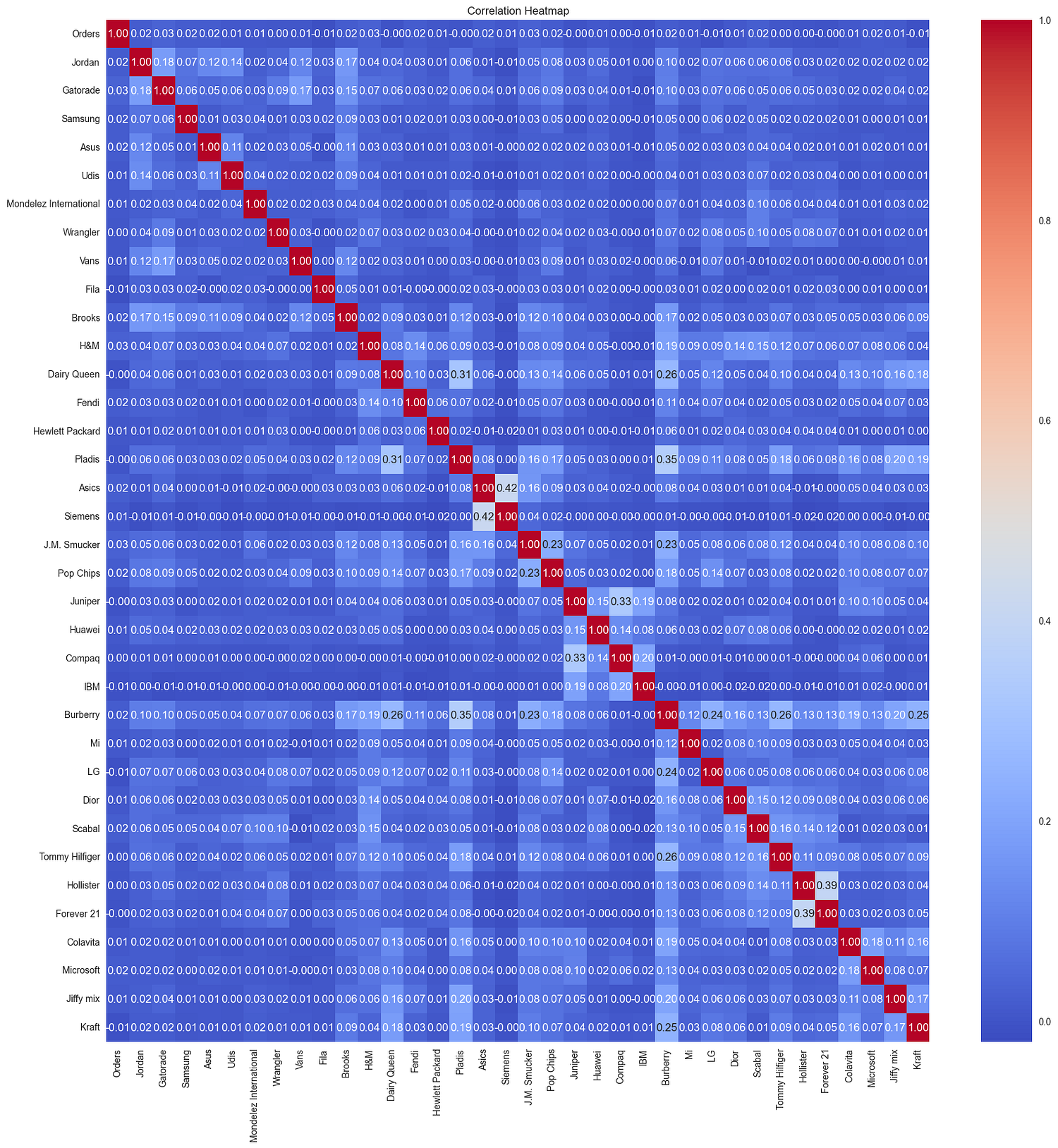
The correlation heatmap reveals:
Low overall correlations: Most features exhibit very weak correlations with one another (close to 0), indicating minimal linear relationships between customer interactions across different brands.
Moderate correlations: A few brand features, such as
Ordersand specific brands likeJordanorSamsung, show slightly higher correlations, suggesting potential overlapping customer behaviors.
This suggests that customer-brand interactions are generally independent, with few overlapping trends.
Pair Plot
# Pair plot for selected features
sns.pairplot(new_df[['Orders', 'Total Search', 'Samsung', 'Gatorade']])
plt.show()
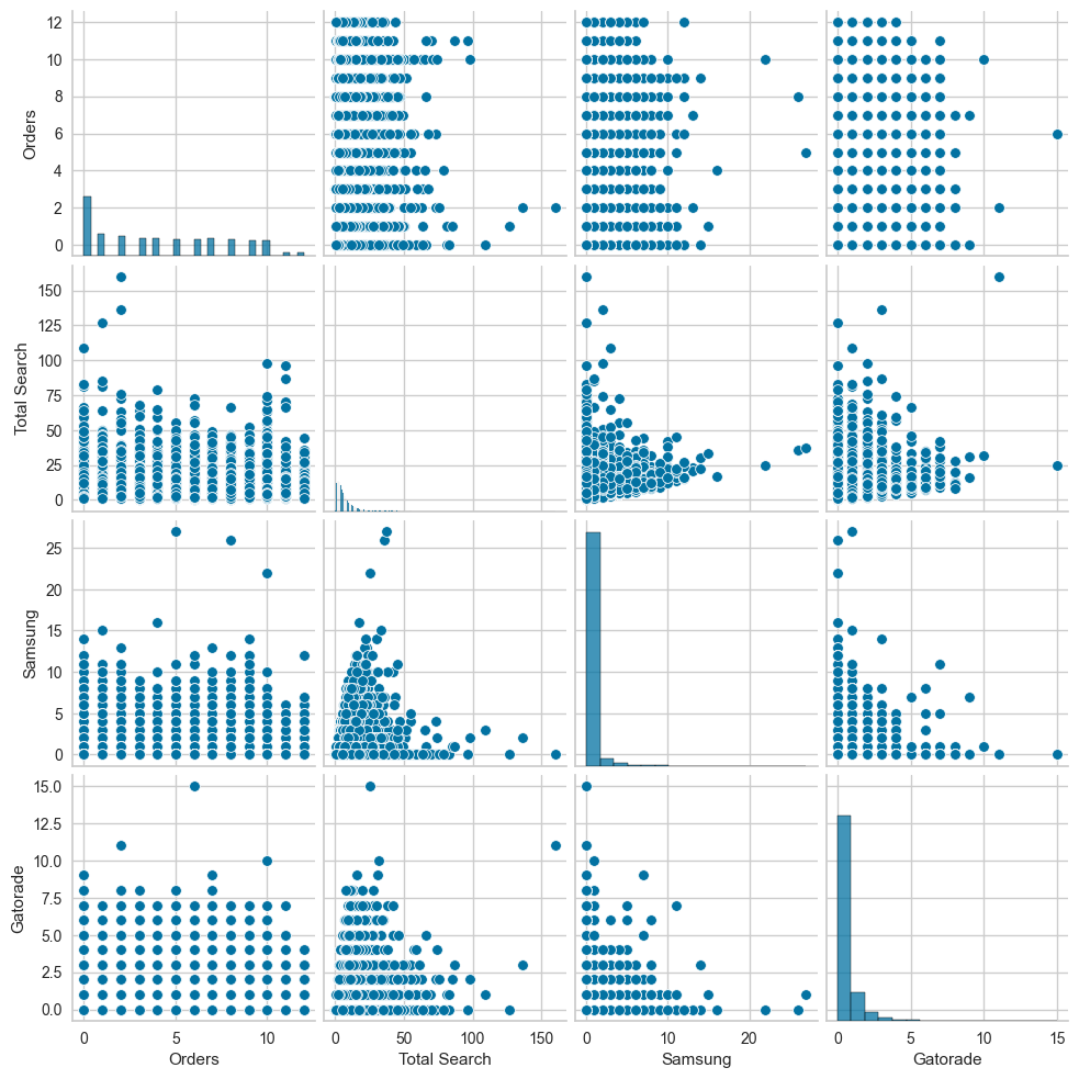
The pair plot shows the following:
Orders vs. Total Search: No clear trend is observed; the points are scattered without a consistent relationship.
Samsung and Gatorade interactions: Both features have highly skewed distributions, with most customers having minimal or zero interactions.
Sparse relationships overall: The scatterplots show sparse data points concentrated near lower values for all features, reflecting low activity levels for the majority of customers.
Outliers: A small number of customers exhibit significantly higher interactions or orders, indicating high engagement.
4. Data Preprocessing
Data preprocessing ensures the dataset is clean and ready for clustering analysis by encoding categorical features and scaling numerical data to standardize the feature ranges.
Encoding Categorical Variables
The Gender column is a categorical variable that needs to be encoded for clustering. It was one-hot encoded to represent the categories (F and M) numerically.
# One-hot encoding the 'Gender' column
gender_encoded = pd.get_dummies(new_df['Gender'], prefix='Gender', drop_first=True)
new_df = pd.concat([new_df, gender_encoded], axis=1)

# Drop the original 'Gender' column
new_df.drop(columns=['Gender'], inplace=True)
print(new_df.head())
   Cust_ID  Orders  Jordan  Gatorade  Samsung  Asus  Udis  \
0        1       7       0         0        0     0     0
1        2       0       0         1        0     0     0
2        3       7       0         1        0     0     0
3        4       0       0         0        0     0     0
4        5      10       0         0        0     0     0

   Mondelez International  Wrangler  Vans  ...  Scabal  Tommy Hilfiger  \
0                       0         0     2  ...       0               0
1                       0         0     0  ...       0               0
2                       0         0     0  ...       0               0
3                       0         0     0  ...       0               0
4                       0         0     0  ...       2               0

   Hollister  Forever 21  Colavita  Microsoft  Jiffy mix  Kraft  Total Search  \
0          0           0         0          0          0      0             2
1          0           0         0          0          0      0            18
2          0           0         0          1          0      0             5
3          0           0         0          0          0      0             2
4          0           0         0          0          1      1            16

   Gender_M
0         1
1         0
2         1
3         0
4         0

[5 rows x 39 columns]
A new column, Gender_M, is added to represent male customers (1 for male, 0 for female).
Feature Scaling
Clustering algorithms like K-Means are sensitive to feature scales. To ensure all features contribute equally to the clustering process, numerical features were scaled to a standard range using Min-Max Scaling.
from sklearn.preprocessing import MinMaxScaler

# Initialize the scaler
scaler = MinMaxScaler()

# Select numerical columns for scaling
numerical_columns = new_df.iloc[:, 2:].columns

# Scale the numerical features
new_df[numerical_columns] = scaler.fit_transform(new_df[numerical_columns])
Min-Max Scaling transforms the feature values to a range of 0 to 1, preventing features with larger ranges (e.g., Orders) from dominating the clustering process.
After preprocessing, the dataset is ready for clustering. Below is the structure of the preprocessed dataset:
print(new_df.info())
   Cust_ID  Orders  Jordan  Gatorade  Samsung  Asus  Udis  \
0        1       7     0.0  0.000000      0.0   0.0   0.0
1        2       0     0.0  0.066667      0.0   0.0   0.0
2        3       7     0.0  0.066667      0.0   0.0   0.0
3        4       0     0.0  0.000000      0.0   0.0   0.0
4        5      10     0.0  0.000000      0.0   0.0   0.0

   Mondelez International  Wrangler   Vans  ...    Scabal  Tommy Hilfiger  \
0                     0.0       0.0  0.125  ...  0.000000             0.0
1                     0.0       0.0  0.000  ...  0.000000             0.0
2                     0.0       0.0  0.000  ...  0.000000             0.0
3                     0.0       0.0  0.000  ...  0.000000             0.0
4                     0.0       0.0  0.000  ...  0.181818             0.0

   Hollister  Forever 21  Colavita  Microsoft  Jiffy mix   Kraft  \
0        0.0         0.0       0.0   0.000000      0.000  0.0000
1        0.0         0.0       0.0   0.000000      0.000  0.0000
2        0.0         0.0       0.0   0.071429      0.000  0.0000
3        0.0         0.0       0.0   0.000000      0.000  0.0000
4        0.0         0.0       0.0   0.000000      0.125  0.0625

   Total Search  Gender_M
0       0.01250       1.0
1       0.11250       0.0
2       0.03125       1.0
3       0.01250       0.0
4       0.10000       0.0

[5 rows x 39 columns]
Key Changes:
The
Gendercolumn was one-hot encoded, creating a numerical representation.All numerical features were scaled to a range of 0 to 1.
5. Clustering for Customer Segmentation
Clustering is used to group customers with similar behaviors and preferences. In this project, we utilize K-Means Clustering and Hierarchical Clustering to segment customers based on their interactions with brands and overall activity.
Determining the Optimal Number of Clusters
To determine the optimal number of clusters, we use the Elbow Method, which evaluates the total within-cluster sum of squares (inertia) for different cluster counts.
# Using KElbowVisualizer
kmeans = KMeans(random_state=42)
visualizer = KElbowVisualizer(kmeans, k=(1, 15), timings=False)
visualizer.fit(new_df.iloc[:, 2:])
visualizer.show()
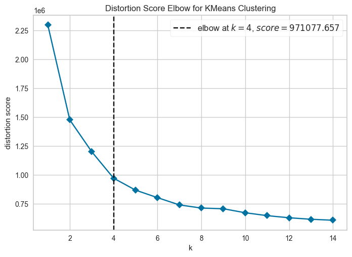
The KElbowVisualizer automates this and identifies the elbow point, suggesting an optimal K of 4.
Silhouette Analysis
To validate the choice of K, we calculate and visualize the Silhouette Scores for each cluster count.
# Calculate silhouette scores for different K values
silhouette_avg = []
for k in range(2, 16):  # Silhouette score requires at least 2 clusters
    kmeans = KMeans(n_clusters=k, random_state=42)
    cluster_labels = kmeans.fit_predict(new_df.iloc[:, 2:])
    silhouette_avg.append(silhouette_score(new_df.iloc[:, 2:], cluster_labels))

# Plot Silhouette Scores
plt.figure(figsize=(10, 7))
plt.plot(range(2, 16), silhouette_avg, 'bX-')
plt.title('Silhouette Analysis for Optimal K')
plt.xlabel('Number of Clusters')
plt.ylabel('Silhouette Score')
plt.show()
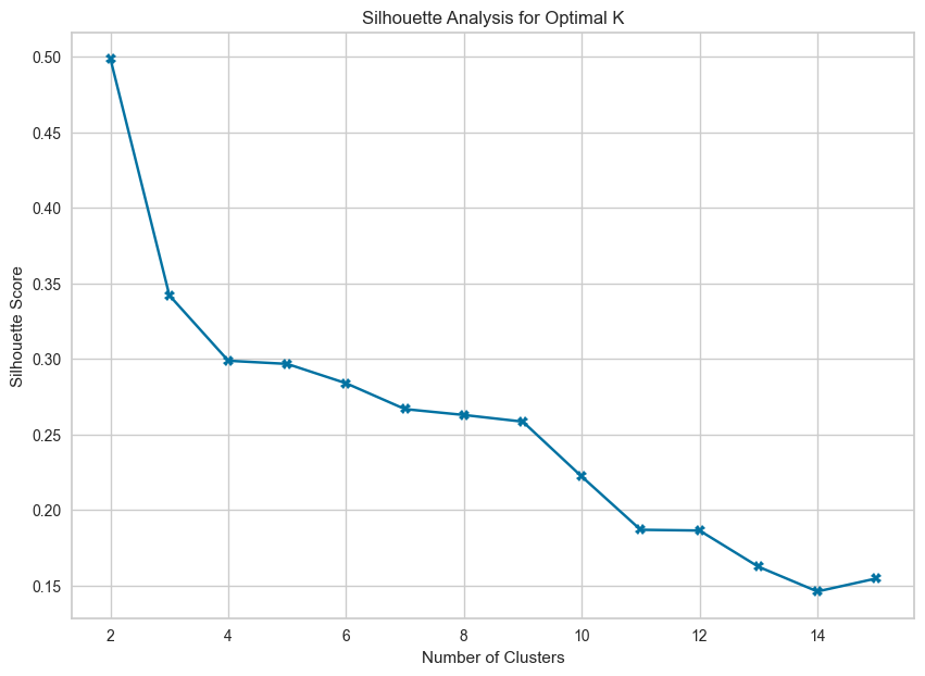
The Silhouette Score peaks at K = 4, validating the elbow method’s results.
Applying K-Means Clustering
Using the optimal number of clusters (K = 4), we apply the K-Means algorithm to segment the customers.
# Apply K-Means with the optimal number of clusters
optimal_clusters = 4
kmeans = KMeans(n_clusters=optimal_clusters, random_state=42)
new_df['Cluster'] = kmeans.fit_predict(new_df.iloc[:, 2:])
print(new_df.head())
   Cust_ID Gender  Orders  Jordan  Gatorade  Samsung  Asus  Udis  \
0        1      M       7       0         0        0     0     0
1        2      F       0       0         1        0     0     0
2        3      M       7       0         1        0     0     0
3        4      F       0       0         0        0     0     0
4        5      F      10       0         0        0     0     0

   Mondelez International  Wrangler  ...  Scabal  Tommy Hilfiger  Hollister  \
0                       0         0  ...       0               0          0
1                       0         0  ...       0               0          0
2                       0         0  ...       0               0          0
3                       0         0  ...       0               0          0
4                       0         0  ...       2               0          0

   Forever 21  Colavita  Microsoft  Jiffy mix  Kraft  Total Search  Cluster
0           0         0          0          0      0             2        0
1           0         0          0          0      0            18        1
2           0         0          1          0      0             5        0
3           0         0          0          0      0             2        3
4           0         0          0          1      1            16        1

[5 rows x 40 columns]
Each customer is assigned to one of the 4 clusters, which is stored in the Cluster column.
Visualizing the Clusters
The Total Search feature is chosen as it represents a cumulative measure of customer interaction with brands, providing a broader understanding of customer engagement. Coupled with Orders, these two features offer insights into:
Engagement Patterns: How actively customers are exploring brands.
Conversion Behavior: Whether high search activity translates into higher order counts or not.
This combination allows us to better identify customer types, such as those with high searches but low orders (potential prospects) or balanced behavior (consistent buyers).
# Scatter plot for clusters
plt.figure(figsize=(10, 6))
sns.scatterplot(data=new_df, x='Total Search', y='Orders', hue='Cluster', palette='viridis')
plt.title('Customer Clusters Based on Total Search and Orders')
plt.xlabel('Total Search')
plt.ylabel('Orders')
plt.legend(title='Cluster')
plt.show()

- Cluster 0 (Purple):
Represent customers with low search activity and moderate-to-high order counts.
Indicates consistent buyers who don’t explore extensively before purchasing.
2. Cluster 1 (Blue):
Balanced engagement with moderate searches and orders.
Represents steady customers who explore and convert proportionally.
3. Cluster 2 (Green):
High search activity but varying order counts.
Likely includes curious customers who engage frequently but may not always convert.
4. Cluster 3 (Yellow):
Minimal engagement across both metrics (low searches and orders).
Represents dormant or less active customers.
Key Insights:
Cluster 2 stands out for its high
Total Searchvalues, suggesting a group of customers with high engagement potential.Clusters 0 and 1 show steady engagement with varying levels of purchasing behavior.
The scatter plot highlights actionable patterns for targeted marketing strategies, such as incentivizing conversions for high-search, low-order customers (Cluster 2).
This visualization emphasizes the diverse behaviors within the customer base, offering actionable insights for segmentation strategies.
Silhouette Visualization
We also use a silhouette plot to assess the cluster quality visually.
# Exclude 'Cluster' column to match features during fitting
features_for_visualization = new_df.drop(columns=['Cluster'])

# Apply K-Means for K = 4
kmeans_k4 = KMeans(n_clusters=4, random_state=42)

# Silhouette visualization for K = 4
visualizer = SilhouetteVisualizer(kmeans_k4, colors='yellowbrick')
visualizer.fit(features_for_visualization.iloc[:, 2:])  # Exclude non-relevant columns
visualizer.show()

- Average Silhouette Score:
The average silhouette score is ~0.3, indicating moderate clustering quality.
Scores closer to 1 would indicate better separation between clusters.
- Cluster-Specific Observations:
Cluster 3 (pink) has the best-defined structure with high silhouette scores across most points.
Clusters 1 (green) and 2 (blue) show moderate separation but with some overlap.
A few points in Cluster 0 (yellow) exhibit negative silhouette scores, indicating potential misclassification or overlap with other clusters.
- Overall Assessment:
- While the clustering provides some meaningful separation, the moderate silhouette score suggests that there may still be overlap among clusters or room for optimization in feature selection or preprocessing.
This analysis validates the use of K = 4 for segmentation but highlights areas for potential refinement.
Hierarchical Clustering
To compare results, we apply Hierarchical Clustering using agglomerative clustering and visualize the dendrogram. We plot a dendrogram that visualizes the hierarchical clustering process, showing how individual points or clusters are merged based on their distance.
from scipy.cluster.hierarchy import dendrogram, linkage

# Perform hierarchical clustering
linked = linkage(new_df.iloc[:, 2:], method='ward')

# Plot the dendrogram
plt.figure(figsize=(12, 6))
dendrogram(linked, truncate_mode='lastp', p=30)
plt.title('Hierarchical Clustering Dendrogram')
plt.xlabel('Cluster Size')
plt.ylabel('Distance')
plt.show()
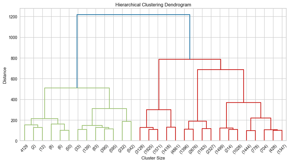
The dendrogram visualizes the hierarchical clustering process, merging points based on distance. The height of the vertical lines represents the distance (dissimilarity) between clusters being merged. At a height of ~1200, two main clusters (blue and red) form, with further branching into smaller subgroups. Cutting at ~600 reveals ~4 clusters, aligning with the K-Means analysis. This hierarchical view complements K-Means by showing relationships between clusters.
This plot highlights the hierarchical relationships among clusters and helps validate the number of clusters chosen in prior steps.
6. Visualizing and Evaluating Clusters
After clustering customers, visualizing and evaluating the clusters help identify the unique characteristics and behaviors of each group. This information can be used to tailor marketing strategies and enhance customer experience.
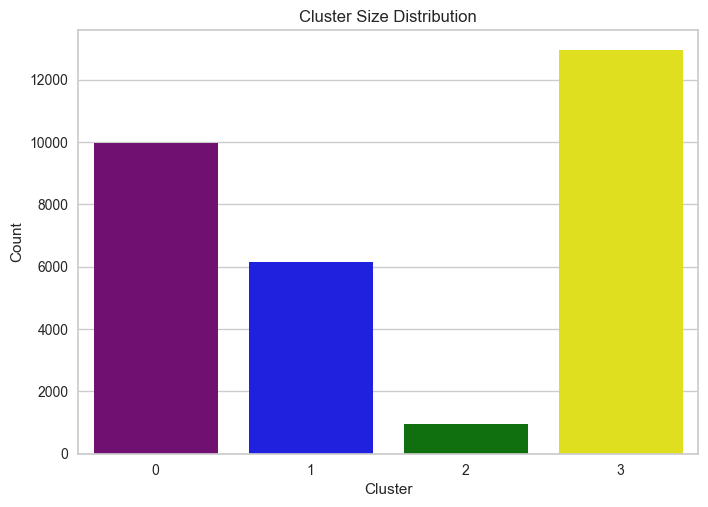
Cluster Size Distribution
We start by examining the number of customers in each cluster.
# Visualize cluster size distribution
sns.countplot(x='Cluster', data=new_df, palette=['purple', 'blue', 'green', 'yellow'])
plt.title('Cluster Size Distribution')
plt.ylabel('Count')
plt.xlabel('Cluster')
plt.show()
Customer Count by Gender
# Customer count by gender within each cluster
sns.countplot(x='Gender', hue='Cluster', data=new_df, palette=['purple', 'blue', 'green', 'yellow'])
plt.title('Customer Count by Gender in Each Cluster')
plt.ylabel('Count')
plt.xlabel('Gender')
plt.show()

The plot shows the distribution of customers by gender within each cluster. Female customers dominate across all clusters, particularly in Cluster 3, which has the highest count. Male customers are significantly fewer, with notable representation in Clusters 0 and 3, and minimal presence in Cluster 2. This highlights a gender imbalance across clusters, with females being the primary customer base.
Total Searches by Gender
# Total searches by gender within each cluster
gender_searches = new_df.groupby(['Cluster', 'Gender'])['Total Search'].sum().reset_index()
sns.barplot(x='Cluster', y='Total Search', hue='Gender', data=gender_searches)
plt.title('Total Searches by Gender in Each Cluster')
plt.ylabel('Total Searches')
plt.xlabel('Cluster')
plt.show()

The plot shows the total product searches by gender across clusters. Female customers dominate search activity in all clusters, especially in Cluster 1, which has the highest search volume. Male customers contribute significantly less to the total searches in every cluster, with their highest activity observed in Cluster 0. This indicates that females are the primary contributors to product searches in the dataset.
Past Orders by Cluster
# Total orders made by each cluster
cluster_orders = new_df.groupby('Cluster')['Orders'].sum().reset_index()
sns.barplot(x='Cluster', y='Orders', data=cluster_orders, palette=['purple', 'blue', 'green', 'yellow'])
plt.title('Past Orders by Cluster')
plt.ylabel('Orders')
plt.xlabel('Cluster')
plt.show()

The plot shows the total number of past orders across clusters. Cluster 0 has the highest number of past orders, significantly surpassing all other clusters. Cluster 1 has a moderate number of orders, while Cluster 3 shows fewer orders. Cluster 2 has the lowest order count, indicating less engagement in purchasing behavior. This suggests that customers in Cluster 0 are the most active in terms of past purchases.
Heatmap for Cluster Feature Analysis
To better understand the distinguishing characteristics of each cluster, we will use a heatmap to visualize the average values of key features across clusters. This approach helps us identify patterns and variations among the clusters.
# Identify the top 10 products based on overall interactions
top_10_products = new_df.iloc[:, 3:].sum(axis=0).sort_values(ascending=False).head(10).index.tolist()

# Add the top 10 products to the relevant features
heatmap_features = ['Total Search', 'Orders'] + top_10_products

# Group by clusters and calculate the mean for the selected features
heatmap_data = new_df.groupby('Cluster')[heatmap_features].mean()

# Plot the heatmap
plt.figure(figsize=(12, 8))
sns.heatmap(heatmap_data, annot=True, cmap='coolwarm', fmt=".1f", linewidths=0.5)
plt.title("Cluster Feature Analysis Heatmap (with Top 10 Products)")
plt.xlabel("Features")
plt.ylabel("Clusters")
plt.show()
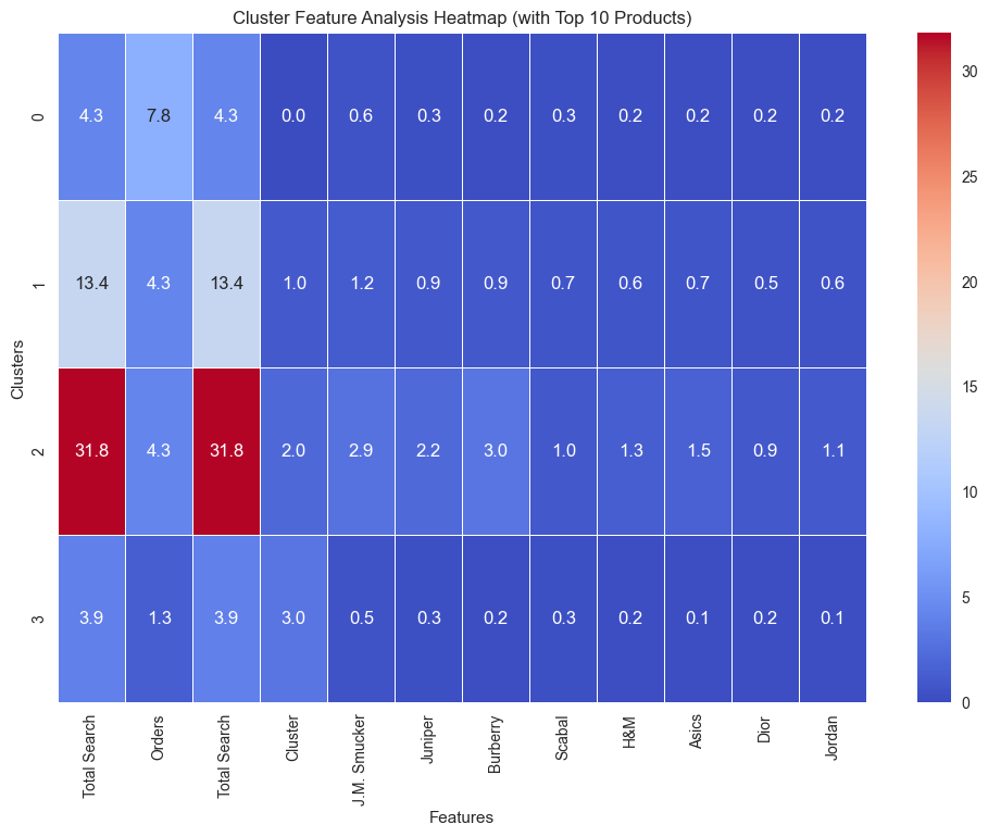
This heatmap provides a detailed view of cluster characteristics across key features and top 10 products:
Cluster 2: Dominates with the highest averages in
Total Search(31.8),Orders(4.3), and significant interactions with brands like J.M. Smucker and Juniper, indicating heavy activity and preference for these products.Cluster 1: Moderate engagement, reflected by an average of 13.4 in
Total Search. It shows varied, but generally low, interactions with products, signifying a mixed but less focused customer group.Cluster 0: Averages lower in
Total Search(4.3) andOrders(7.8), with minimal product interactions, suggesting light engagement across most brands.Cluster 3: Lowest activity overall, with
Total Searchat 3.9 and very low product interaction scores, indicating a disengaged or low-priority customer segment.
This analysis highlights distinct behaviors for each cluster, aiding targeted marketing strategies.
7. Business Insights and Recommendations
The clustering analysis revealed distinct customer groups with unique behaviors and preferences. Here are the key insights and potential business strategies for each cluster:
Cluster 0: Moderately Engaged Customers
Key Characteristics:
Moderate activity in terms of total searches and past orders.
Female customers dominate this group significantly.
Business Implications:
These customers are engaged but not highly active. Providing targeted promotions, such as discounts or free shipping on repeat purchases, could increase their activity.
Personalized email campaigns focusing on top-searched products (e.g., J.M. Smucker, Juniper) might resonate well.
Cluster 1: Active Searchers
Key Characteristics:
High total search activity but relatively low past orders.
The majority are female customers with a smaller male representation.
Business Implications:
These customers seem interested but hesitate to convert searches into purchases. Introducing time-limited offers or cart abandonment strategies could drive conversions.
Highlighting user reviews or testimonials for frequently searched products like Burberry and Scabal could build trust and encourage purchases.
Cluster 2: High-Value Customers
Key Characteristics:
Significantly higher total search and past order activity compared to other clusters.
Includes both genders, with a slight female majority.
Top interactions with products from J.M. Smucker, Asics, and Dior.
Business Implications:
These are loyal, high-value customers. Offering exclusive benefits such as early access to sales, loyalty rewards, or VIP customer programs could retain and further engage this group.
Highlight complementary products to maximize basket size during purchases.
Cluster 3: Low-Engaged Customers
Key Characteristics:
Lowest activity in total searches and past orders.
Balanced gender distribution.
Business Implications:
This segment requires nurturing to increase engagement. Sending introductory offers, personalized product recommendations, or surveys to understand their needs could re-engage them.
Educating them about the product categories they’ve shown minimal interest in may also be beneficial.
General Insights:
Across all clusters, J.M. Smucker, Juniper, and Burberry emerged as the most popular brands. These can be used in marketing campaigns to attract broader customer interest.
Female customers dominate search and purchase activity across clusters, suggesting a need for gender-specific marketing strategies.
Recommendations:
Develop a retention strategy for Cluster 2.
Create conversion-focused campaigns for Cluster 1.
Test re-engagement strategies for Cluster 3.
Implement promotional campaigns around top-performing products to cater to all clusters.
By leveraging these insights, businesses can optimize customer engagement and drive higher revenue through personalized and targeted strategies.
8. Conclusion and Enhancements
Conclusion
The customer segmentation analysis provided valuable insights into distinct behavioral patterns across different customer groups. The use of clustering algorithms, combined with visualizations and feature-specific analysis, allowed us to:
Identify four distinct customer clusters with unique engagement levels and preferences.
Highlight the top-performing brands and products, such as J.M. Smucker and Juniper, which resonate well with customers.
Derive actionable business strategies tailored to each cluster, focusing on retention, conversion, and re-engagement.
This segmentation serves as a foundation for personalized marketing strategies, ultimately driving customer satisfaction and business growth.
Potential Enhancements
While the analysis was comprehensive, several improvements can enhance the robustness and applicability of the results:
Feature Expansion: Incorporate additional features such as customer demographics, purchase frequency, or browsing behavior to provide deeper insights into customer preferences.
Dynamic Clustering: Experiment with other clustering techniques, such as Hierarchical Clustering or DBSCAN, to validate and compare cluster consistency. Besides, you can try using a combination of K-Means and Gaussian Mixture Models (GMMs) for advanced segmentation.
Temporal Analysis: Analyze temporal patterns, such as seasonal product preferences or changes in customer behavior over time, to uncover evolving trends.
Predictive Modeling: Build predictive models for customer lifetime value (CLV) or churn prediction to complement the clustering insights and proactively address customer needs.
Interactive Dashboards: Develop interactive dashboards using tools like Power BI or Tableau to visualize customer insights dynamically, making it easier for stakeholders to explore and utilize findings.
Real-Time Analysis: Implement real-time clustering or recommendation systems to personalize the customer experience instantly, enhancing engagement.
By implementing these enhancements, the segmentation framework can evolve into a more dynamic and scalable solution, ensuring continuous improvement in customer engagement and business performance.
Appendices
Code: https://github.com/Minhhoang2606/eCommerce-customer-segmentation/blob/master/main.py
Data source: https://www.kaggle.com/datasets/gobikhak/e-commerce-customer-segentation-dataset


